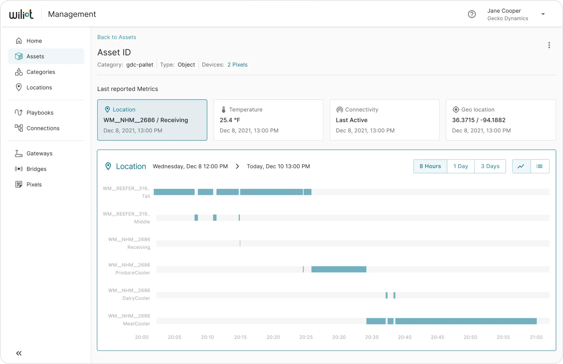
What the page needed to handle
The Asset page exists to show a prospective customer what Wiliot's tracking can do for one specific asset — but it wasn't holding up as assets generated more metrics and more events. What came out of research and usability review:
- Show custom events for every metric, as both a chart and raw data
- Export event data as CSV
- Filter events by a custom time range
- Hold up for assets with a high volume of events
- Improve chart visualization generally
How we found this
User interviews surfaced where the page was hard to use, and Pendo analytics showed which parts of it customers actually touched versus what was going unused. From there it was wireframe iterations exploring different layouts for pages with very different data volumes, then prototypes validated with stakeholders.
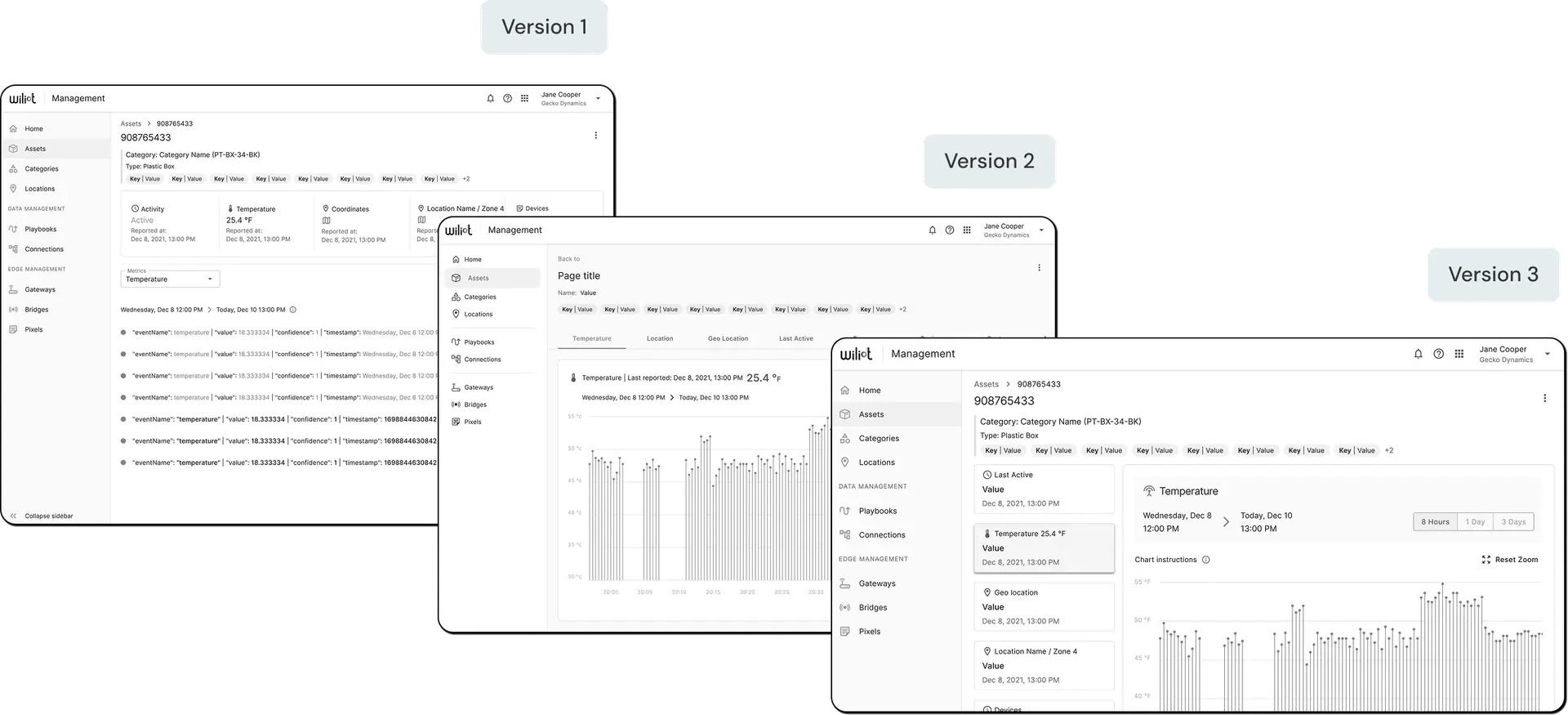
Three layout directions — wireframe versions explored before landing on a master-detail structure: a scrollable single column, a tabbed page-title layout, and the master list plus detail panel that eventually shipped.
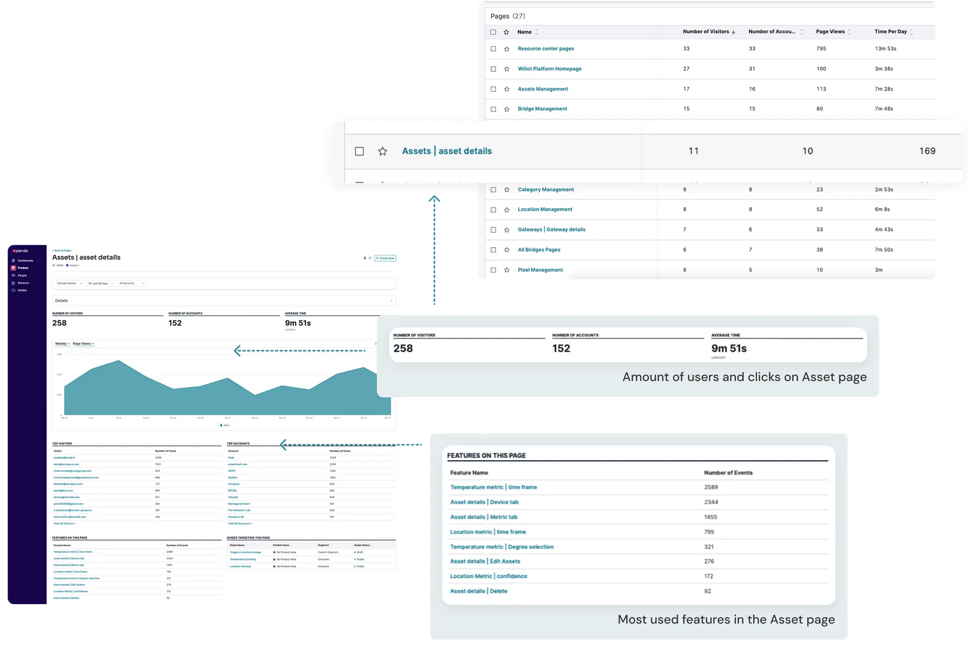
Pendo usage data — visits, time on page, and which features on the Asset page (temperature charts, device tabs, edit actions) were actually being used, versus built and ignored.
What we changed
Each change traces back to a specific gap in the old page.
Master-detail layout
Replaced the long single-column scroll with a master list plus a detail panel, so moving between an asset's info and its metrics doesn't mean scrolling back to the top.
Devices folded into the header
Dropped the separate Devices tab and surfaced an asset's connected devices as a link right in the page title.
Added a Geo location metric
A new metric card surfaces an asset's coordinates directly, instead of leaving location as something you had to infer.
Chart and list, for every metric
Each metric, temperature and location included, now gets both a chart view and a raw event list, with a toggle between them.
Location History chart
Added a dedicated history chart for location, layered under the live reading, instead of only showing the latest position.
Final design concept
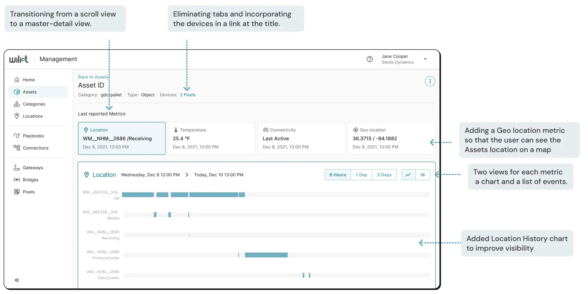
Redesign, annotated — the master-detail structure, devices folded into the title, and the added Geo location and Location History metrics, side by side with the version that shipped.
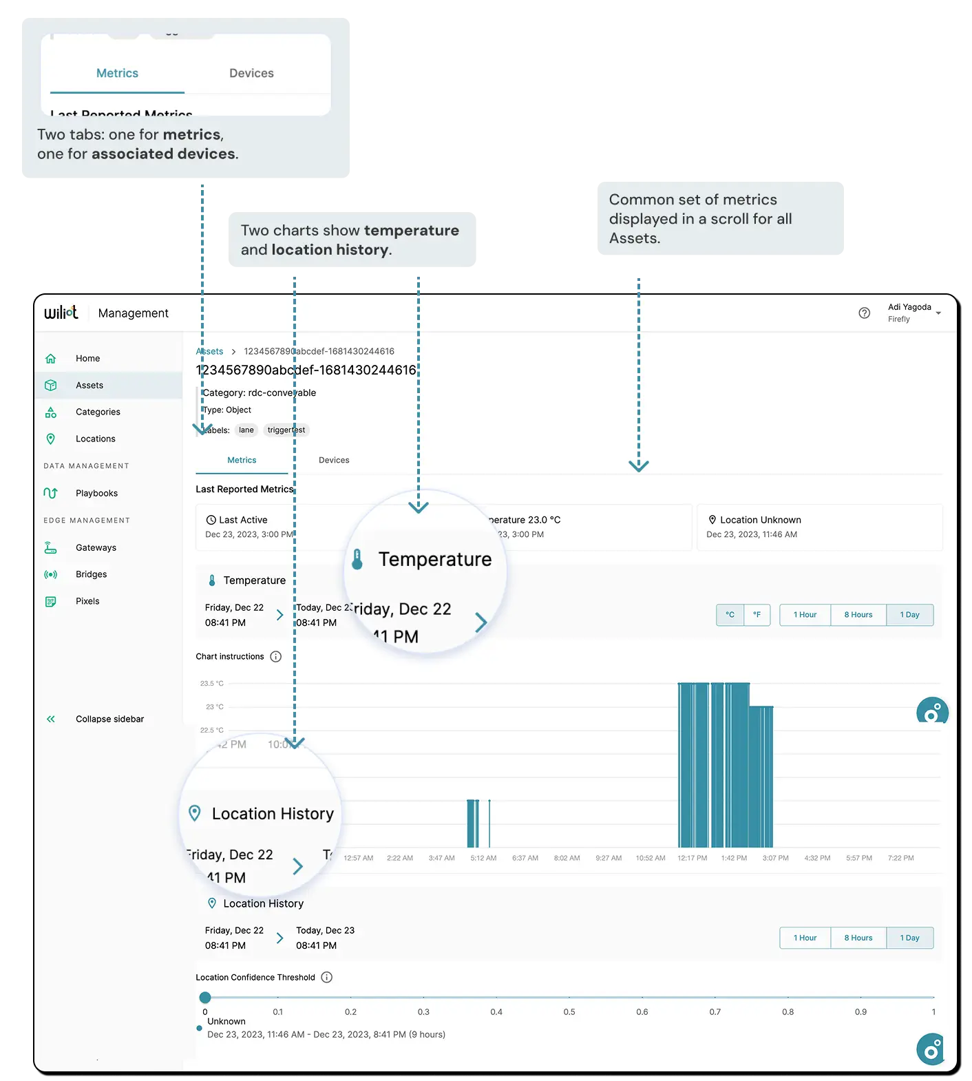
Metrics and devices tabs — the finished page: two tabs (metrics, associated devices), a common set of metrics scrollable for every asset, and a chart plus event list for temperature and location each.
Prototype — Once a layout was finalized, we built a prototype to showcase the new page design and its functionality, then went back to the same interview participants to walk through the concept and get their approval before moving forward.
What's next
- Deepen Pendo analytics with paths and funnels, not just page-level usage
- Integrate Category configuration into the page
- Work with Sales on measuring the page's impact on deals
- Keep gathering stakeholder feedback for further refinement
Want to go deeper on any of this?
Happy to walk through the wireframe iterations, the Pendo data behind the priority calls, or why the master-detail layout won out.